
Monday, August 1, 2016
Dementia-Friendly Environment- Colors
Colors could affect and even alter the way we perceive the world! How we can utilize colors and contribute to a dementia-friendly environment? The aging process involves deficiency in visual effectiveness and especially for people with dementia. Therefore, they perceive colors such as violet, blue, and blue-green to be darker due to the fact that those colors have a shorter wavelengths. Some visual symptoms are due to the aging process while some are in the result of dementia. Researches urged that bright primary colors are much easier for dementia people to distinguish. And because people with dementia have a harder time to perceive the world in a three dimensional perspective, designers can take advantage of bright primary colors to create contracting floors and walls to assist people with dementia as well as ensure safety. However, it is important to be aware that complicated pattern or color variation need to be prevented because people with dementia usually perceive those elements into something dangerous or uncertain such as a hole or something falling down.

Dementia-Friendly Environment- Psychological Support
We have talked about the relationship between architectural characteristics and dementia-friendly environment. However, we haven't discussed the most powerful but invisible part— psychological support. Their feeling matters a lot! There are indicators that could identify whether the community has achieved to become a dementia-friendly environment.
Here are some major indicators that all of us can start to think about how we could take them into actions.
1. Understanding of dementia as a disease
Dementia is lack of public understanding and many family are afraid of seeking help from the professionals. Therefore, it is important to improve public perception towards the disease. We need to let people understand that they are not alone and we can face the disease positively. Also, the treatment is most effective when for the preliminary stage of the disease so having the disease be diagnosed earlier will help control and decrease the speed of the aging process. As elders start to reveal some dementia symptoms, their emotional health and memorization will be affected. We have to learn how to interact with them and respond their physical and mental needs.
2. Let people with dementia get involve
Public usually think that people with dementia needs assistance and ignore their aspirations of completing tasks on their own. It is the sense of achievement that contributes to the mental health of the elders. Understand their ability and personality is a key and allow them to accomplish certain tasks on their own will make their lives different. Family, caregivers, and the people surround dementia patient will also need to develop programs for dementia people to take part in and fully enjoy. We all feel positive when we can achieve something and we all need the feeling of "being needed".
Here are some major indicators that all of us can start to think about how we could take them into actions.
1. Understanding of dementia as a disease
Dementia is lack of public understanding and many family are afraid of seeking help from the professionals. Therefore, it is important to improve public perception towards the disease. We need to let people understand that they are not alone and we can face the disease positively. Also, the treatment is most effective when for the preliminary stage of the disease so having the disease be diagnosed earlier will help control and decrease the speed of the aging process. As elders start to reveal some dementia symptoms, their emotional health and memorization will be affected. We have to learn how to interact with them and respond their physical and mental needs.
2. Let people with dementia get involve
Public usually think that people with dementia needs assistance and ignore their aspirations of completing tasks on their own. It is the sense of achievement that contributes to the mental health of the elders. Understand their ability and personality is a key and allow them to accomplish certain tasks on their own will make their lives different. Family, caregivers, and the people surround dementia patient will also need to develop programs for dementia people to take part in and fully enjoy. We all feel positive when we can achieve something and we all need the feeling of "being needed".
Saturday, July 23, 2016
Dementia-Friendly Environment- Circulation
Today I want to talk about the features I found from several journal articles that could possibly contribute to a dementia-friendly environment. I notice self-orientation is one of the biggest challenge for people with dementia so I look into floor plan configurations and try to find out if there is certain circulation that could assist way-finding.
Here are four circulation types the scholar researched on.

Some general findings include avoiding long corridors and making visual differences for various functional spaces to assist wayfinding ability and spatial orientation. Another research group focuses on floor plan and circulation design and discovers that L-shaped building seem to result in the best wayfinding performance. They also explores that residences live in corridor-like design reported gradually decrease in various ability. Some scholars suggest allowing a good amount of clear visual access so that the space will be easier for residences to navigate. It seems like the major design considerations include:
1. Create anchor point (point of reference) by utilizing visually and functionally significant design for spaces with different function.
2. Simple circulation with minimum turning points but avoid long corridors.
3. Maximize visual access so that residences will be able to identify where they are, where to go, and even recall where they intend to go.
Here is the findings on floor play layouts! Please stay tuned for more discoveries.
Here are four circulation types the scholar researched on.

Some general findings include avoiding long corridors and making visual differences for various functional spaces to assist wayfinding ability and spatial orientation. Another research group focuses on floor plan and circulation design and discovers that L-shaped building seem to result in the best wayfinding performance. They also explores that residences live in corridor-like design reported gradually decrease in various ability. Some scholars suggest allowing a good amount of clear visual access so that the space will be easier for residences to navigate. It seems like the major design considerations include:
1. Create anchor point (point of reference) by utilizing visually and functionally significant design for spaces with different function.
2. Simple circulation with minimum turning points but avoid long corridors.
3. Maximize visual access so that residences will be able to identify where they are, where to go, and even recall where they intend to go.
Here is the findings on floor play layouts! Please stay tuned for more discoveries.
Monday, October 20, 2014


Wednesday, October 15, 2014
Enchanting Future- LaCrosse Brewery
 |
| After researching LaCrosse and doing case studies of micro-brewery, we then worked on developing the design. We are trying to preserve the rock houses as they are significant historical heritage and it symbolize the hard time they had when exploiting the town. I added an extension and incorporate fenced outdoor area into my design in order to attract people's attention. I would love to grow more trees in LaCrosse especially areas surround rock houses because there are currently no enough shades. The fountain at the front will provide a nice space for people to rest and it is also a visual interest. For the interior, the wine holding tank are visible in the wine tasting area to create a more engaging atmosphere. I would like to create a family style brewery where people love to go and there is a children's place besides the brewery for children to play in. Although there are limitations within the brewery theme, it seems to be a project with high potentials of promoting the town and bringing economic growth. |
LaCrosse Inforgraphic
LaCrosse, WA
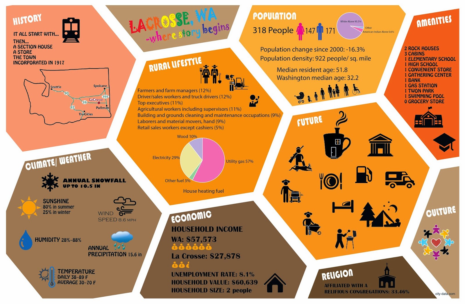 |
| LaCrosse is a small town in Whitman county. The rock houses were donated to LCP (LaCrosse Community Pride) so they were hoping to utilize the space and property in a meaningful way. Before we get start on the project itself, we research the town and try to understand different aspects of the site. It is important that we understand the culture of the town and consider what kind of design would fit the community very well. I like how straight forward a inforgraphic could present to the viewer and how icons become a the subject matter instead of wordy description. LaCrosse is a town that born because of the railroad and there are abundant natural resources within the town. Interestingly, the median resident age is 51.8 and there are only one convenient store. With all of the promising proposal we have for LaCrosse, we are hoping to construct a better future for the town and make rock houses become a turning point for the community. |
Monday, September 15, 2014
Micro-Brewery Case Studies
 |
| Because we are trying to turn the rock houses in a small town called LaCrosse into a small brewery, it will be beneficial for us if we look at other successful brewery story. To my surprise, this now well-know brewery actually start pretty small but eventually get to a very successful business. It reveals the potentials of a micro brewery in a small town such as LaCrosse. Brewery provides a place for people to retreat from their daily work and immerse into a cheerful and encouraged place. I also see how the green actions a brewery take to preserve the earth serve as a strong model for the community to follow. The belief and commissions a brewery follow shape and influence the community in a great sense. I hope to learn from this case and take those positives into our brewery project in LaCrosse community. |
 |
| Allagash Brewing Company is another case I chose to study because they did an amazing job in inventing new flavors of beer.The ability to keep developing a business and moving forward is the vital element behind a successful business. The founder Rob Tod start from a small 15 barrel brewhouse but finally became a fantastic brewery with lots of great beer in their portfolio. They are a company who really cares about the community and sought to provide a enchanting environment for the town. They also contribute some of their profit in supporting groups and organizations in their home state. It seems that a micro brewery could be a very good choice for LaCrosse to begin with and it could be a driven force to improve the economic of the town. |
Tuesday, December 10, 2013
Harmonious Balance- Atrium Space in IT Building
Harmonious Balance- Atrium Space in IT Building

We got a chance to design the atrium space in Information Technology Building. This atrium space used to be an outdoor space that connects to the natural environment; however, due to the new construction of the VIP Building for football game, the atrium became an enclosed area and it can no longer achieve natural daylight. As designers, we were asked to come up with design solutions with focus on workplace design, place theory, and light and color effect. Our goal is to construct a new atrium that meets the needs of office users and becomes a place where design classes can be inspired from. Because there are lots of office units surround the atrium space, the interaction between these two space is very important and thus we need to make sure the activities happen in the atrium will not interfere with people working in the office and people inside offices are willing to open up their curtain to enjoy the innovative atrium.
In order to understand how officer users feel about the change from an outdoor atrium space to an enclosed are, we conducts several interviews to discover problems and possible solutions. We also showed clients our preliminary designs to see what we can improve. Working with real clients helps us understand the important role of being an interior designer. Interior designers are responsible to take clients' needs into consideration and come up with the design strategy that is beautiful while practical.
My idea came from "Rainforest Cafe" where people enjoy dining in a rain forest environment with aquarium surround. I would like to use this concept to develop the current atrium and let it successfully mimic the atrium of the past and remind people of the natural world. I would let the atrium become a wonderland where people can find inspiration, innovation, and creativity. I hope the atrium will be a place where people can rejuvenate themselves and become productive after a rest in the atrium. The artificial plantings and trees placed on the ceiling establish the rain forest atmosphere and because they are not real, people do not need to take good care of them. The aquarium bar counter further reinforce the idea of a wonderland.
"Light in Action" Physics Principles

“Is it real” is the most impressive experiment which a solid frog seems to appear in front of our eye but it is actually inside a bowl beneath the virtual frog image we perceive from above. I am going to use this concept on the base part of the water fountain. Putting objects like star, fish, inside this reflective bowl and let people who see beside perceive the virtual image. However, when people try to touch it, they will understand this trick.

“Color Mixing” is another lighting idea I am going to installed around the water fountain. Having different light beam surround the fountain, the result will be marvelous as different light color mix with each other and present a new color.
Boundary County Library Project- Personal Poster
Boundary County Library Project- Personal Poster

Workplace Case Study
Workplace Case Study

Tuesday, November 19, 2013
Library/ Community Workshop/ Fab Lab Case Studies
Library/ Community Workshop/ Fab Lab Case Studies


We got an opportunities to do case studies about fab lab, community workshop, small town library, and city library to develop our understanding of different specific facilities. These case studies play an important role in design process and they help us build up the Boundary County Library project. I didn't know what a fab lab should look like until I did the research and the community workshop I found is quite interesting and impressive because of their organizational goal. I enjoy doing case studies to discover innovative design solutions and strategies.
Doing case studies gives us a chance to understand different project, facility, and organization and how designs serve different function of the spaces. We learned from the cases we studied and applied them into our future projects. Constructing a further research let us have knowledge of particular facilities we are going to put in our library project. I realized how decisions were made and how people can change and imporve their build environment.
Monday, April 29, 2013
INFINITE CONTINUITY


I chose Stephen Powell, who is a talented glass blowing artist as well as a professor of central college in Kentucky as my client. Designing the artist studio floor plan is perhaps the most challenging part for me because I need to research for every equipments a glass blowing artist would need and place the equipments very carefully as kiln, glass blowing furnace, glass lath, pipe warmer, etc... are equipments work with fire and produce lots of heat. Therefore, I managed those dangerous equipments in an particular area and defined that area as hot zone. I also found out that glass blowing studio should include a water zone for artist to cool down the glass work, tool and sometimes performing chemical toxic involved job. The safety concerns play an important role in the studio design that I decided to install firewall, sprinkle system and ventilator to ensure the safety of the studio. The office is also located in the area near the entrance to the gallery space because I want the artist to have more opportunities interacting with his clients and make the transit from office to gallery more convenient and efficient.

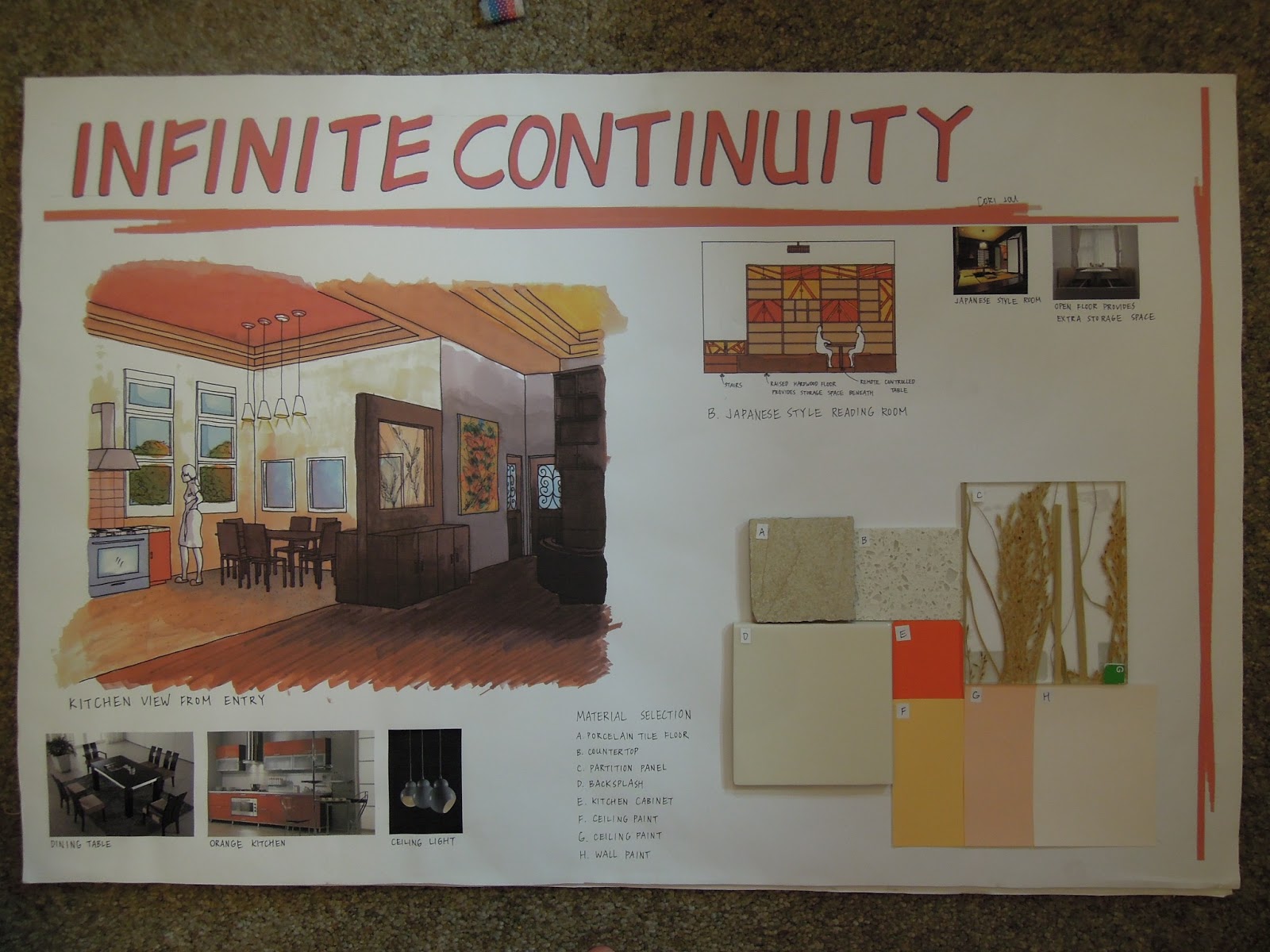
The concept development is where I keep finding my inspirations through out the semester. I initially focus on the whole train I found in Pufferbelly Depot because the color combination catches my attention and gives me an powerful feeling. I am interested in how the development of train changes people's life by connecting people and distant places. I think that train really connects people and gives people an option to get to far places; however, due to the nature of the train, train transportation cannot take people to everywhere. It indicates the limitation of the train and drives me into the thinking that humans are oftentimes restricted by the stereotype and the natural world. We are sometimes limited ourselves according to how others think of us and their perspective. However, the red in the train clearly explain that people want to break out the rules and overcome the challenges. We are people that desire to keep improving ourselves and break down the stereotype. I chose the parti which introducing the main railways with many little secondary railways as my final module and use bold color such as red, orange and yellow to transform the eagerness of exceeding the limitations.


After choosing the final module, we play with different kinds of repetition and combinations of the module to create beautiful fabric pattern which we are going to use in the interior of our Depot design. I found the textile design inspires me a lot as I need to pour more meaningful thoughts into my design. I first tried different color arrangement and finally I discovered that the interchanging of yellow-based and red-based modules reveal the rotation of the train spokes and most important of all, it symbolizes the life cycle of human beings. As people stare at the center of the star-looked shape, we can somewhat feel the rotation of the spoke and the speedy movement of the train. It looks like a circle without definite starting point and ending point just like how human beings go with the life cycle. Though we have date birth and come the world and we also have the last day of our life span, people are inherit from the ancestors and keep developing the world and making it a better place.


.jpg)
The final gallery perspective is another challenging part to me because I feel like I am not good at visualizing the space. With that in mind, I start to work on my perspective early and find pictures to enhance my visualizing skills. Drawing perspectives also help me decide the more detailed parts pf my design such as material and furniture selection, outdoor landscape seen from the interior windows and doors, and lighting features which I never thought about on the furniture floor plan. I remember the thing I want to improve the most of the project I done in last year is the rendering perspectives. At that time, I was not quite familiar with the rendering skills and I felt that I didn't do well on communicating my space through perspectives. This time, I think I have a better understanding of how to make the rendering perspectives effectively communicating my interior design. I believe rendering perspectives are the most crucial part of the design in translating and visualizing the design project and I think I successfully make the most of my rendering perspectives.
After this competitive and overwhelming semester, I strongly believe that I did improve my abilities as being an interior design student especially in critical thinking, interior design strategy and rendering skill. I also learn the importance of time management that I hope I can push myself to work more efficiently and perform the works quickly while still maintain the quality of the drawings. I experienced the team work through the historical research paper and understand how to value different perspectives. I think I improve myself a lot in overcoming the fear of presenting in front of lots of people. I can clearly feel my personal progress through the difference and changes from the past.
Wednesday, March 20, 2013
The Beauty of A Gallery

Bank Left Gallery
100 S Bridge Street, Palouse, WA
Type of work exhibited: Sculpture, painting, ceramic, fabric,
decoration, furniture, glass, postcard, earring
Square footage of exhibit space: 800 sq.ft

My friends and I visited an art gallery in Palouse during our Spring break to get some inspirations on how to design an efficient and appealing gallery space. They have a wide range of art works. Some of them displayed in cabinets while some of them are placed on the top of tables.

| I realized that they tried to put artworks with similar styles together to create a harmony and unity. The yellow and orange walls in this smaller room indicate that we are entering a different space. |

They also utilize pedestals and cases to show the art works. I found that pedestals is really desirable for sculpture while those small show cases are more suitable for smaller objects.The overall environmental color is clam blue-green because of the carpet. The white clean walls help visitors concentrate on the beauty of the artworks.

There is a hanging device that used to hang the doll as we can see on the right side of the picture.We discovered that there is an obvious difference between the upper part and the lower part of the wall which to me is a little distracting. The spot light on the wall lightening up particular artwork is really effective. I believe they help catch people's attention and make the artwork even more charming and valuable.
 |
| The glass show case here is somewhat not as bright as other displays but it open up the space and let people focus on the artwork. It might because the lack of spot light that let me feel this area is not as important as other area. I think it might be better if they can install some lights inside the glass cases or maybe hang some spot lights on the wall. |


The ceiling is very unique and represent the architectural style of the old era. I felt that the square pattern on each of the panel echo with the paintings within the frames. The gallery is lightened up by an ideal amount of natural light and therefore I did not pay much attention on the artificial lighting features. I guess the gallery will be darker during the night due to limited amount of artificial lighting. However, consider the opening hours the gallery has, they might not require a great amount of lighting.

I like how the paintings are arranged and I think the smaller paintings direct people and introduce the larger paintings above. Our eye will follow the display unconsciously.
The site visit gave me a basic idea on how to arrange the artworks in a gallery space and how to utilize natural light and spot light. Though the gallery is pretty small and has limited amount of artworks, I learned from it and started to think about a successful gallery.
Tuesday, March 19, 2013
Impaired Vision Experience
We got a chance to experience vision impaired. We use plastic bag, sunglasses with Vaseline applied on the inside, and vision simulator tool to perform this activity. When I looked through the plastic bag, I immediately feel that the entire world is blurry and I am not confident that I can walk by myself because there are several wrinkles on the plastic bags that cause the vision even blurry. When I looked through the layers and read a newspaper, I founded that I can barely read the big title but for the rest of the newspaper, I can't recognize at all. We then fold the bag in half to experience the vision through four layers of plastic. I already feel the blurry through two layers because I am slightly near-sighted so four layers of plastic is extremely hard for me.

The vision simulator tool is actually fun because I found I can see through it without too many difficulties except for the bottom one. The bottom one will make me be a real blind. There are two vision that seems to tell us the difference between the white part of our eye and pupilla. I thought the pupilla is how we can actually see because when I look trough the third one, I need to turn my eye to see the surrounding.
After experiencing the impaired vision through plastic bag, I put on the pair of sunglasses which is already apply a thin layer of Vaseline inside the glasses and walk through the CUB. I can feel that there are people walking toward me and I am able to walk without others' help. However, I only have the vision of approximately 15' so I need to pay more attention to the surrounding area. I think I walker a little bit slower than normal because I am afraid of being vision impaired but I finally made myself in front of the elevator. It is kind of fun because other people have no idea that the sunglasses I wore is decreasing my vision ability. I then feel comfortable and push the bottom and go to the down stair.

I tried to use the ATM machine and figured out the location of the card swipe and key-paid. I am not familiar with the ATM machine so it took me some time to figure out where the card swipe and key-paid is. It is frustrating because there are other device similar to card swipe and I can't see the numbers one the keyboard.
Next, I went through the library from CUB and noticed that there are a divider between the door accessing to the library. I believe it is a potential danger to people with impaired vision. The floor underneath is changing and thus I was able to realize that I am entering a different space. There are black strips on the edges of each stairs which is really helpful to identify. This is perhaps the biggest discovery of the impaired vision experience. I figured out that stairs in the outdoor are usually having no distinguishable strips but some of them acquire caved strips. Both caved strips and black strips play an important role for people with impaired vision and also beneficial to add resistances to prevent slippery.

The vision simulator tool is actually fun because I found I can see through it without too many difficulties except for the bottom one. The bottom one will make me be a real blind. There are two vision that seems to tell us the difference between the white part of our eye and pupilla. I thought the pupilla is how we can actually see because when I look trough the third one, I need to turn my eye to see the surrounding.
After experiencing the impaired vision through plastic bag, I put on the pair of sunglasses which is already apply a thin layer of Vaseline inside the glasses and walk through the CUB. I can feel that there are people walking toward me and I am able to walk without others' help. However, I only have the vision of approximately 15' so I need to pay more attention to the surrounding area. I think I walker a little bit slower than normal because I am afraid of being vision impaired but I finally made myself in front of the elevator. It is kind of fun because other people have no idea that the sunglasses I wore is decreasing my vision ability. I then feel comfortable and push the bottom and go to the down stair.

I tried to use the ATM machine and figured out the location of the card swipe and key-paid. I am not familiar with the ATM machine so it took me some time to figure out where the card swipe and key-paid is. It is frustrating because there are other device similar to card swipe and I can't see the numbers one the keyboard.
Next, I went through the library from CUB and noticed that there are a divider between the door accessing to the library. I believe it is a potential danger to people with impaired vision. The floor underneath is changing and thus I was able to realize that I am entering a different space. There are black strips on the edges of each stairs which is really helpful to identify. This is perhaps the biggest discovery of the impaired vision experience. I figured out that stairs in the outdoor are usually having no distinguishable strips but some of them acquire caved strips. Both caved strips and black strips play an important role for people with impaired vision and also beneficial to add resistances to prevent slippery.
Friday, December 7, 2012
Habitat for Humanity- Building house for local family in need

As the architecture on site reminded us, "safety comes first and then quality quality quality", we make every effort to meet the family's needs and architectural standards. We had a blast learning the structure of the house and having the hands on experience of "constructing" the house.
Harmony: One bedroom Apt


It is very hard for me to come up with an ideal floor plan with just a little try. In face, I drew lots of different floor plan and referred to accessible guide when I design the space. Besides, the 86 inches long windows really limit my possibility of design. I was very happy that the reviewer who is an architectural professor like the z zag shape along the bathroom and bedroom. I like the storage space I planted for the one-bedroom apartment. I believe an ideal amount of storage space enable people who live in the apartment to have a tidy and organized living area and thus make their living experience happier. After this intensive project, I believe I have an better understanding on how to draw elevations, sections and floor plans efficiently and effectively.
Wednesday, November 28, 2012
Meeting with a designer
We got a chance to meet with professional interior designer on campus to do a review on our floor plan for one bedroom apartment. It is a great chance to grab some input and brand new ideas for improving the current design we have. Sharon Macy is the interior designer working for school facility includes dorms on campus, apartment out of campus, major dining centers and other design project.
I was very frustrated on the living room I planed for the one bedroom apartment because it looks quite small and inflexible. Sharon suggested me to extend the wall in front of the entrance to create a more enclosed living area while add little more space for it. The original setting for the entrance is first a closet with shoe rack beneath adjoined with a sofa for people to put on their shoe. However, the adjoined part with limit the function of the closet and thus she said it will be nicer to separate them into two individual and make the sofa near to the door. In addition, the space mainly used for passing each different rooms seem to be empty. Therefore, she recommended to add a small desk for informal use. In that way, the circulation will not be interfered while making the space become more lively. The most importance improvement of the design is the advice for bathroom design. As grab bars are important for making the space accessible, the length of it and how it install become important. There are two windows on the wall where I need to add grab bars for both the toilet and the bath tub, so the best way to make the grab bars seem smoother is either make two of them into one long grab bar or make two separate bars without interfere with one another.
I came with new thoughts in mind. I decided to add a wall cabinet with mirror in the middle beside the front door. I believe it can not only create a sense of harmony but also enhance the number of useful storage. I also determine to add 1' wide wall cabinet at the front of living area to accommodate television and other stuff such as art works and books. I also want to add some decorative book shelf above the sofa. Since I was a little fear about not having a required distance after putting those shelves. I turned to the guideline to figure out the proper distance between television and the viewers which is 4 to 10 feet for a 30" television. I now know that I can install those shelves and still keep a nice distance. It is perhaps the meeting with a professional designer and the input of their design tastes that let me think of more possibility of my design. Making me can't help but being eager to improve and polish my design later on.
I was very frustrated on the living room I planed for the one bedroom apartment because it looks quite small and inflexible. Sharon suggested me to extend the wall in front of the entrance to create a more enclosed living area while add little more space for it. The original setting for the entrance is first a closet with shoe rack beneath adjoined with a sofa for people to put on their shoe. However, the adjoined part with limit the function of the closet and thus she said it will be nicer to separate them into two individual and make the sofa near to the door. In addition, the space mainly used for passing each different rooms seem to be empty. Therefore, she recommended to add a small desk for informal use. In that way, the circulation will not be interfered while making the space become more lively. The most importance improvement of the design is the advice for bathroom design. As grab bars are important for making the space accessible, the length of it and how it install become important. There are two windows on the wall where I need to add grab bars for both the toilet and the bath tub, so the best way to make the grab bars seem smoother is either make two of them into one long grab bar or make two separate bars without interfere with one another.
I came with new thoughts in mind. I decided to add a wall cabinet with mirror in the middle beside the front door. I believe it can not only create a sense of harmony but also enhance the number of useful storage. I also determine to add 1' wide wall cabinet at the front of living area to accommodate television and other stuff such as art works and books. I also want to add some decorative book shelf above the sofa. Since I was a little fear about not having a required distance after putting those shelves. I turned to the guideline to figure out the proper distance between television and the viewers which is 4 to 10 feet for a 30" television. I now know that I can install those shelves and still keep a nice distance. It is perhaps the meeting with a professional designer and the input of their design tastes that let me think of more possibility of my design. Making me can't help but being eager to improve and polish my design later on.
Monday, October 22, 2012
BATHROOM DESIGN

My concept is driven from the clear edge and sharp angles of a triangles. I defined the three angles of a triangle as ourselves, family and home which reveals design relationship of the space. These three vital elements are expressed in the function of the bathroom design. The on-floor lower cabinet can be used as a stool for children while the other are designed for the elders. I intended to create a space that fulfill all kinds of need because it is a family and it is home. The bath tub I chose, the wall lighting, ceiling lighting and the pink recycled-glass doors of cabinets are all revealing triangle shapes. The color application is mainly neutral color because it suggests harmony through out the space.
Monday, October 8, 2012
Client Brief


 |
| Having a interview with the client help us understand his expectation and preference. It is great to ask the client some design issues face to face because we can realize what he needs better instead of sending e-mail. We figured out that he is very conscious about being sustainable and eco-friendly. He also wanted to preserve the site as much as possible. And because it is pricy to change the position of those plumbing, we will keep the bathroom and kitchen at the same position due to the budget. I found bubble diagram and adjacency matrix help for finding the relationship between each room. Designers can discover which king of spaces should be near to each other while some spaces should be separated significantly. |
Subscribe to:
Posts (Atom)