I finally bond those sketches together and create a cover and a back for it. I feel so proud of myself and I feel a great sense of achievement.
sketch#10-2
Trying to show the value change in the space using high contrast methods.
Sketch#10-1
I drew the space in one-point perspective and try to show the depth of the space.
Sketch#9
I find it difficult to draw this sketch because I didn't know how to get started. I have to focus on the negative space and let the positive space in blank. As a result, the positive space becomes very bright and apparent.
Sketch#8
It's cool to draw on black paper; however, I hope there is sand paper I can draw on as the paper I drew cannot present the density and vitality of colors.
Sketch#7
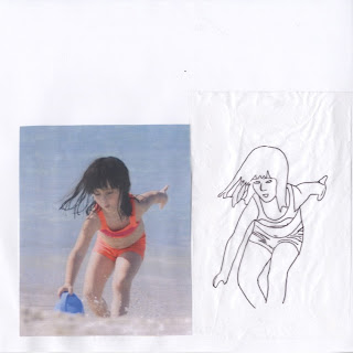
It is fun to trace the figure as I can clearly feel the movement and flow. I can concentrate on the contour line and focus on the details.
Sketch#6
It is really interesting to draw the dissection of some fruit. I find it hard to use black pen and color pencil together cause it somehow becomes blur. I think I might only use color pencil to draw the next time when I want to show colors.
Sketch#5 Corner
This is a corner of my room. The cross-hatching skill is a good way to create shade and tint. However, I feel that I intended to keep the edges of the corner and thus cannot show the real shadow. I think I need to have more practice to improve my cross-hatching shading skill as I am used to applying hatching shading. The important thing might be find out the way to produce smooth cross-hatching shade.
Sketch#4
I really like the chair I drew and I found it interesting to look through different angle. This kind of drawing help me build up the sense of three-dimensional space.
Sketch#3
It's cool to draw something on napkin. Actually, it's not easy to draw on napkin because of the surface.
Sketch#2
Creating a mind map inspired my creativity and imagination. I figured out that the words first came to my mind were mainly related to my background and experience. Therefore, some words might not make sense to other.
Sketch#1
I think this sketch is really successful as we can see obvious contrast between different value. The tint and the shade really form a solid outcome.
In Class Sketch
I think the keys are fine; however, the wallet is not good at all as we can't see the depth and thickness. If I can do it again, I will focus on the fold of the wallet and try to show the thickness.


No comments:
Post a Comment